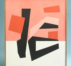
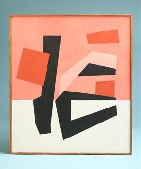
Scandinavian Art
One of the things I love about Pinterest is discovering [...]
One of the things I love about Pinterest is discovering [...]
I came across the online portfolio of art director & [...]
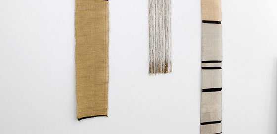
Re-Pin This: http://pinterest.com/pin/173318285631453139/ WOVEN WALL PANELS by JUSTINE ASHBEE source: [...]
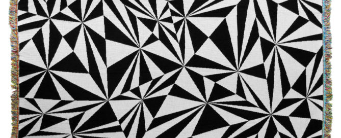
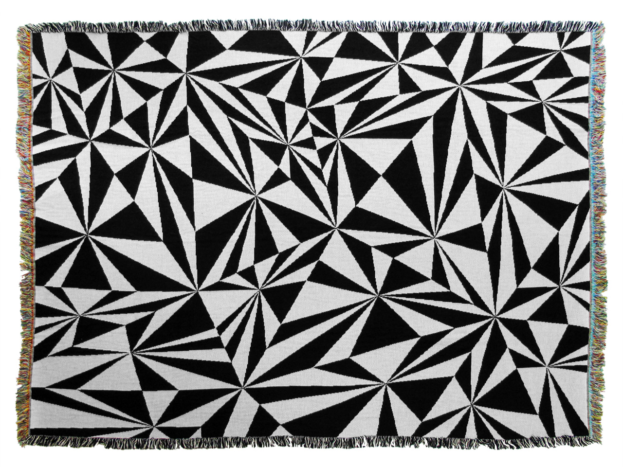
I love this jacquard loom woven afghan by graphic artist [...]
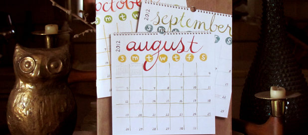
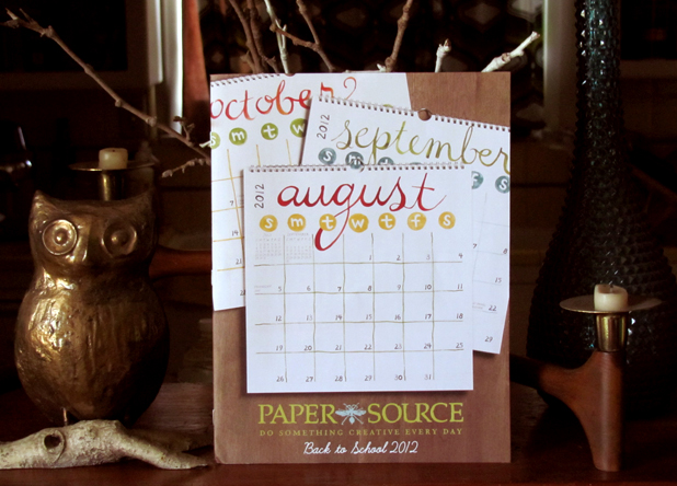
When the Paper Source catalog arrived in the mail yesterday, [...]
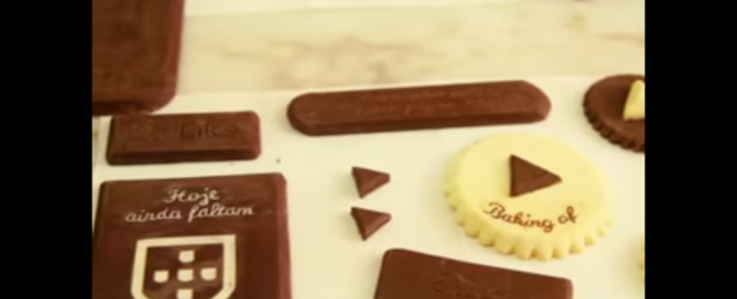
This is really cool. When Portuguese beer maker Sagres released [...]
My lovely clients have kept me so busy for the [...]
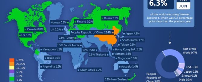
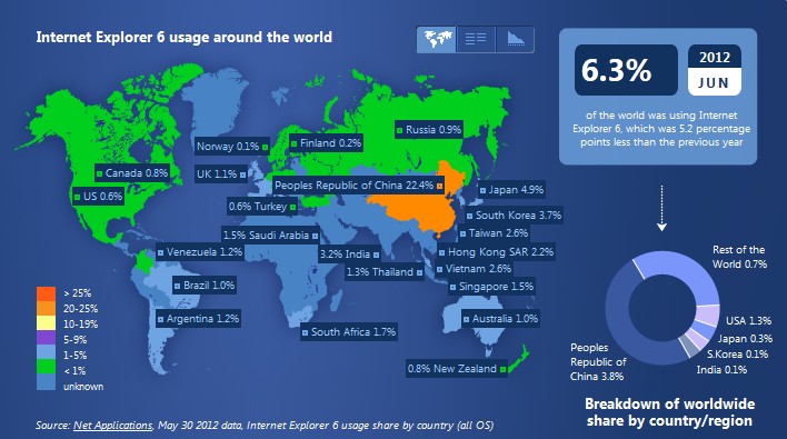
It is surprising to see that there are still some [...]
Cute short about the history of glitter from etsy. It [...]
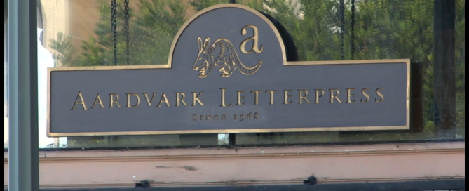
Great student film about the oldest paper shop & print [...]
