I came across the online portfolio of art director & graphic designer Brigitta Bungard today. She is part of the design team at The Museum of Modern Art in New York. One piece in her portfolio that really stood out was the title wall for a German Expressionism exhibit that she created along with her MOMA teammates Julia Hoffmann (creative direction), Jesse Reed (design), Paulette Giguere (production artist). They won several awards for the design including Communication Arts: Design Annual 52, 2012; Type Directors Club: Typography Annual 33, 2012; Global SEGD Design Awards: Merit 2012; and Print Magazine Regional Design Awards, 2012.
About the exhibition via segd.com:
German Expressionism: The Graphic Impulse was
an exhibition of more than 250 prints, drawings, paintings, sculptures,
illustrated books, and periodicals drawn from MoMA’s collection of
3,000 pieces from this period. The vast amount of work inspired the idea
of transforming the galleries into a time capsule of sorts—prompting
visitors to feel as if they were walking into a cumulative presentation
of this unique movement of art’s many works.
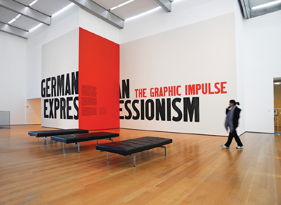
The
title wall was clearly legible as visitors exited the elevators to
enter the 6th floor Special Exhibition Gallery, but as they approached
the entrance, they discovered the shift between the walls, which cut the
title in two. This cut, emphasized by the red wall color, also
symbolized World War I, a pivotal point for the German Expressionist
movement and artists. Inside the exhibition, visitors could see this
motif repeated in the layout and color of the gallery walls. The
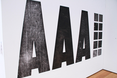
in-house design team used letters from an old wood type alphabet, which
at huge scale emphasized the imperfection of prints, yet still felt bold
and contemporary. A closer look revealed how the black letters were
painted with the texture of an enlarged woodcut, alluding to the texture
of many of the prints in the exhibition.
The challenge of utilizing a large gallery space for the title of an
exhibition is choosing the appropriate proportion and scale, and the
team was able to capitalize on the exhibition’s long title to create an
atmosphere that might not have been possible under other circumstances.
View the rest of Brigitta’s portfolio here: http://www.brigittabungard.com/
source: brigittabungard.com
photo credit: Martin Seck

